 grobstein
 21 March 2016
Responsive and Mobile Design
Nowadays, mobile design is super important. With majority of the population using mobile devices, websites have a responsive design in order to adhere to smaller screens. Designing for mobile devices consists of more than just scaling down a site designed for the computer. Many components are taken into consideration. Some of the most important are listed below:
1. Concise and to the point
Mobile users are generally on the go and don't like to spend too much time finding what they need on your site. Designers may condense navigation into the top left or top right part of the screen. They often take the most important focal points of the site and place them as the first point of entry, whether it's an article, search bar, or featured product. The Shutterfly website features the discounts as the main point of view, followed by all the buying and creating options in their mobile design, whereas the computer version has a navigation bar, sample products, and other features.

2. Designed for touch screen use
Mobile devices rely on fingers of all sizes or a stylus to use on their touch screens. Since fingers are all different sizes, buttons and other clickable items on mobile devices must be big enough. Looking at the shutterfly example again, the buttons for shopping are big enough to be viewed on a small screen, and also to be clicked on by fingers of any size.3. Serif vs. Sans Serif font
On the computer, type is much easier to read than on a mobile device. Since the screen is smaller and is most likely being used on the go, a sans serif type is easier to read on a mobile device because of their thick and consistent form. The serifs on type are hard to read on a small screen because of the variation in thicks and thins on the type's strokes. Thinner strokes tend to not appear on a small screen, making the type more illegible.4. Reorganize navigation bars
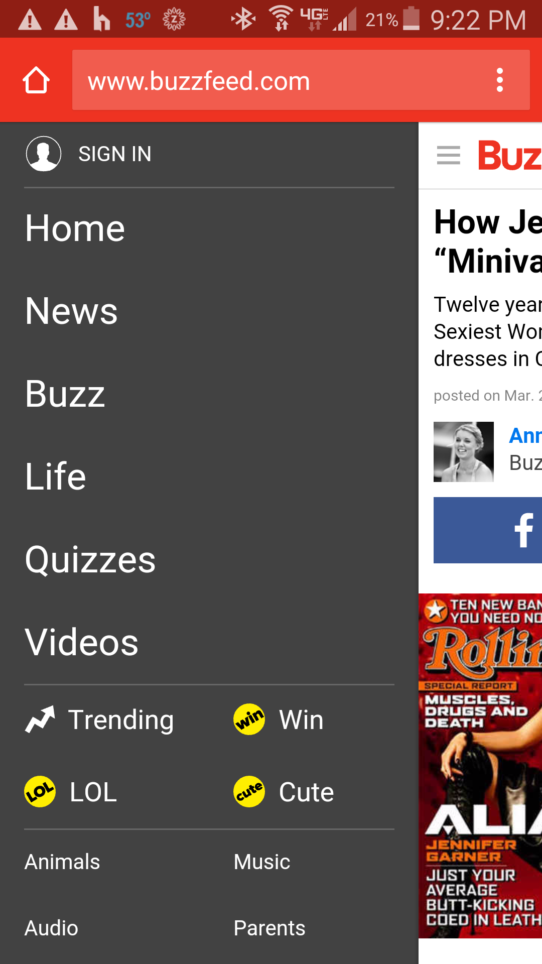
One of the typical elements of a web page is a navigation bar toward the top of the page, or running down the left. Since screen space is a valuable commodity on mobile devices, a navigation bar tends to not work as well as it does on a computer screen. There are several options to go around the navigation bar: condense the navigation bar into a menu on the top left or right of the screen that pulls out, condense the navigation into a few options at the top under the header, or place the menu options at the forefront as the Shutterfly example does. In the example below, Buzzfeed uses a common method of condensing the navigation into a menu by using three horizontal lines on the top left. When you click it, the navigation options pull out.Computer:

Mobile:

5. Minimize or eliminate images
Images make a site look beautiful. The only problem with having them on a mobile device is that the connection these devices have vary in strength, which can make the images on the page load slower. The more image-heavy a site is, the longer a site will take to load, which loses the interest of the user much faster. Consider eliminating large images, as Shutterfly has done, or minimize the amount that show up on the main page, as Buzzfeed does. Another option to lessen the load time is to use svg (scalable vector graphics). These are drawn by code and require very little load time. While they cannot replace a photograph, they are generally used for icons and smaller graphics.TOP