1 February 2016
Trendy Type
I love studying type. It can make or break a design, even if your visuals are stellar. After reading the article on different type trends, I reflected on the way I use type. I tend to err on the side of caution and stay away from decorative fonts. However, I have a deep appreciation for designers that can use decorative fonts in an aesthetically beautiful way. It can be hard! Two trends that I've researched and am reporting on are Handwritten fonts and Slab fonts.
Handwritten Fonts
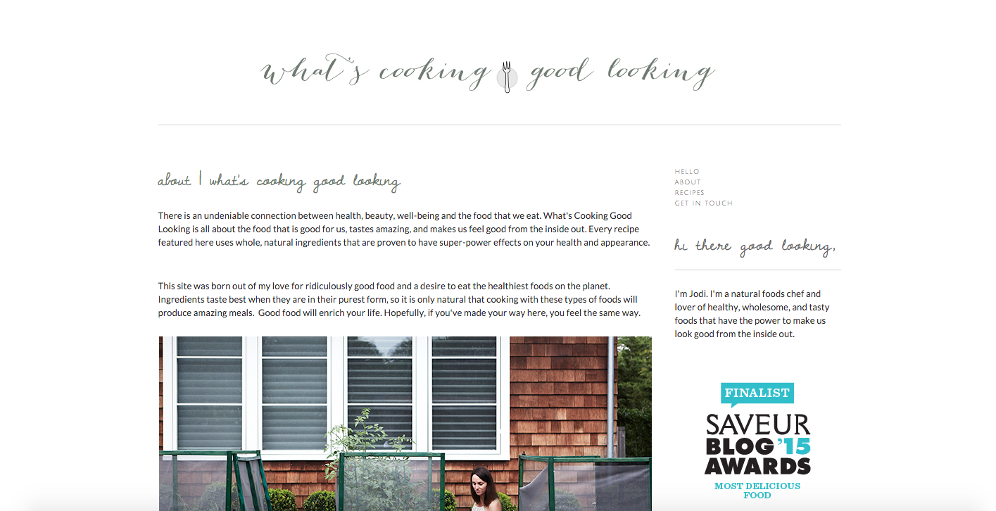
Website Name: What's Cooking Good Looking?
Font Used: "Dawning of a New Day", unsure of typeface in header
Does it work?: It does. Food blogs give a "you can do it at home!" vibe, and I think the handwritten typeface really adds to the Do-It-Yourself mood. It conveys a message of connecting personally to the audience in a very casual sense.
Slab Fonts
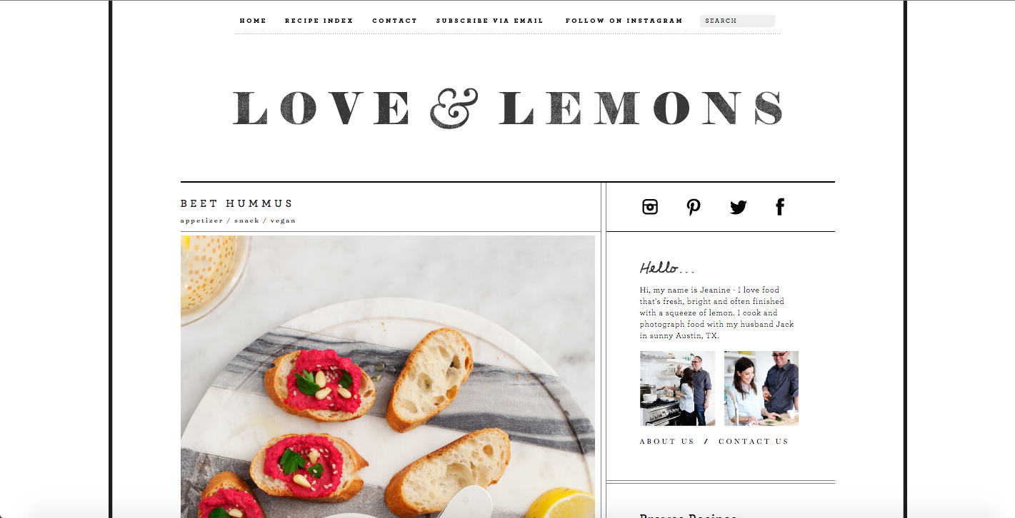
Website Name: Love and Lemons
Font Used: "Archer SSm A", unsure of typeface in header
Does it work?: A lot of food blogs have handwritten fonts in their sites. I was interested to find this one because it has more of a slab font. But what was interesting about the header is that even though it is a slab font, it has thin strokes paired with very thick strokes. I think this lightens up the slab font and comes off professional, yet feminine. The text is in a slab font that makes it look like a typewriter, which does give it a personal, hand-made mood.
TOP